The Challenge
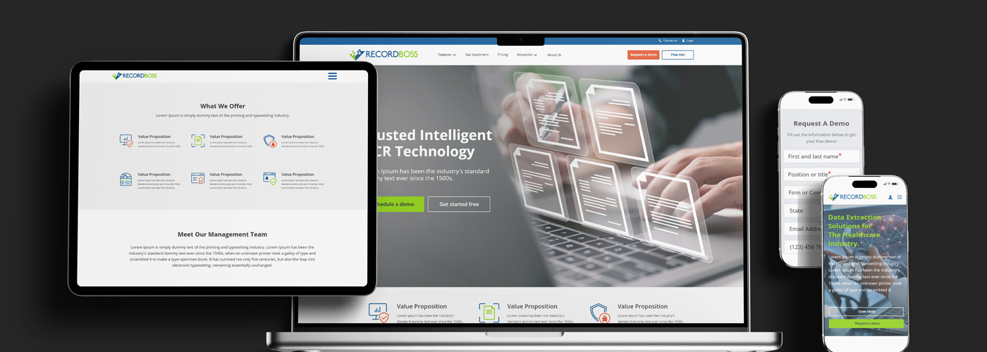
The client needed more than just a functional website, they required a cohesive digital experience that would effectively communicate their brand while delivering seamless usability across devices. The website had to present information clearly, maintain a professional and trustworthy appearance, and provide a consistent experience on desktop, tablet, and mobile platforms.
The Goal
The goal was to create a modern, responsive website that would strengthen the brand’s online presence and provide visitors with an intuitive browsing experience. By combining thoughtful design with responsive development, the website was built to enhance credibility, improve accessibility, and support the brand’s long-term growth across all digital touchpoints.
01 Creative Process
We approached this project with the goal of creating a digital experience that felt modern and professional while maintaining a strong and recognizable brand presence.
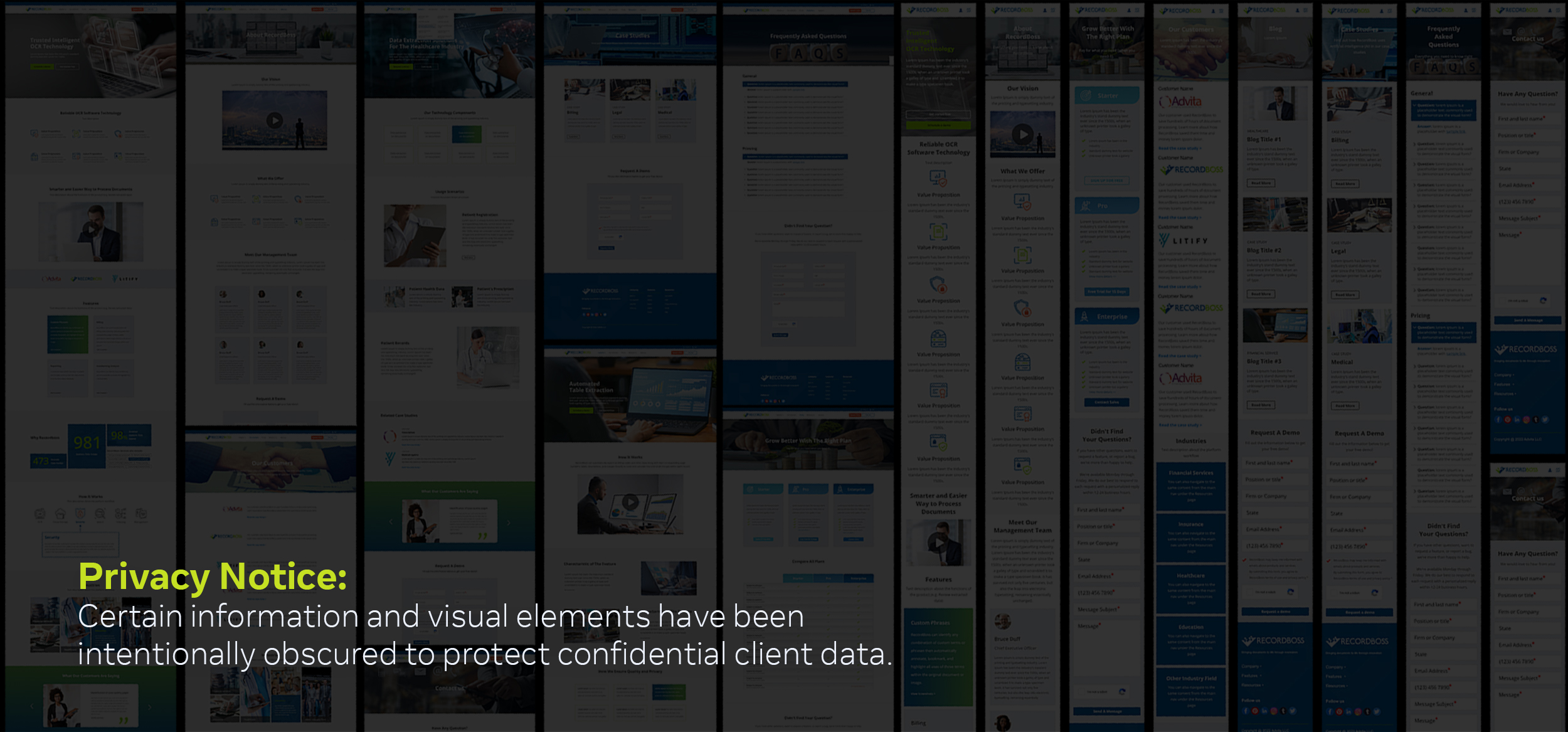
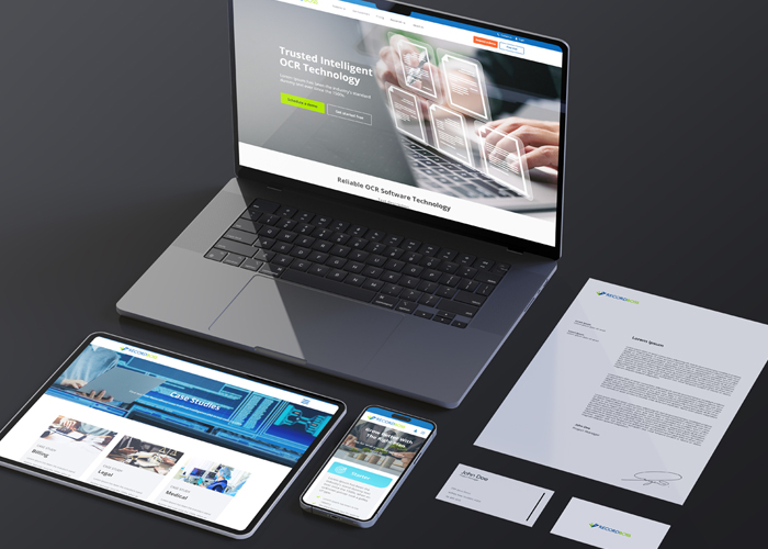
We first established a visual direction that could seamlessly adapt across desktop, tablet, and mobile devices. Every section was carefully designed to ensure consistency while optimizing the user experience for different screen sizes. The desktop layout prioritized content clarity and visual impact, while the tablet and mobile versions were refined to provide intuitive navigation and accessibility without compromising the overall brand experience.
To further strengthen the website’s effectiveness, we focused on creating a clean information hierarchy, responsive layouts, and thoughtful interactions that would guide visitors naturally through the site. The result was a cohesive and engaging web experience that reinforces the brand identity while supporting long-term digital growth.

02 The Result
The completed website delivered a cohesive and engaging digital experience that strengthened the brand’s online presence while providing a seamless experience across devices.
The result was a refined digital platform that enhances usability and reinforces the brand identity:
- A cohesive website experience that delivers consistency across desktop, tablet, and mobile devices
- Thoughtfully designed layouts that improve navigation and create a more intuitive user journey
- A clear visual hierarchy that enhances readability and communicates information effectively
- A polished and professional online presence that builds trust and elevates perceived value
- A flexible digital foundation that supports future growth, content expansion, and long-term brand consistency